Learning Curves ที่ใช้ในการวิเคราะห์ประสิทธิภาพ Machine Learning Model

Learning Curve
>> เป็นกราฟที่ใช้วิเคราะห์ประสิทธิภาพการเรียนรู้ของ Model จาก Training Dataset ซึ่งแกน x ของกราฟจะเป็นครั้งที่เรียนรู้ (Epoch) และแกน y จะเป็นประสิทธิภาพของ Model โดยประสิทธิภาพของ Model จะถูกวัดหลังจากการปรับปรุง Weight และ Bias ด้วยข้อมูล 2 ชนิด ได้แก่
- Training Dataset ที่ Model กำลังเรียนรู้
- Validation Dataset ซึ่งไม่เคยถูกใช้สอน Model มาก่อน
โดยประสิทธิภาพของ Model จะวัดได้จาก Loss และ Accuracy ซึ่งยิ่งค่า Loss หรือ Error น้อยแสดงว่า Model ยิ่งมีการเรียนรู้ที่ดี แต่สำหรับค่า Accuracy จะเป็นในทางตรงกันข้าม คือยิ่งค่า Accuracy มาก แสดงว่า Model ยิ่ง มีการเรียนรู้ที่ดี
Underfit Learning Curve
- โดยเราจะจำลองสถานการณ์ของ Model ที่มีปัญหาการเรียนรู้แบบ Underfit ด้วยการพัฒนา Model เพื่อทำ Sentiment Analysis จาก IMDB Dataset ซึ่งเป็นคำวิจารณ์ภาพยนตร์ต่างประเทศ
โดย Dataset แรกจะเป็น IMDB
ก่อนอื่นเราจะ Import Library ที่จำเป็นต้องใช้ในการทดลองดังต่อไปนี้
from tensorflow.keras.datasets import imdb
from tensorflow.keras.models import Sequential
from tensorflow.keras.layers import Dense
from tensorflow.keras.optimizers import SGD

from tensorflow.keras.utils import to_categorical
from tensorflow.keras.preprocessing import sequence

import plotly
import plotly.graph_objs as go
import plotly.express as px

from matplotlib import pyplot

import numpy

from sklearn.datasets import make_moons, make_circles, make_blobs
from pandas import DataFrame

from sklearn.model_selection import train_test_split

import pandas as pd
Load Dataset
top_words = 5000
(X_train, y_train), (X_test, y_test)= imdb.load_data(num_words=top_words)
max_words = 500

X_train.shape
imdb.get_word_index()
ต่อ Train และ Test Dataset เพื่อคำนวนคำที่ไม่ซ้ำทั้งหมดใน Comment
X = numpy.concatenate((X_train, X_test), axis=0)
y = numpy.concatenate((y_train, y_test), axis=0)

print("Number of words: ")
print(len(numpy.unique(numpy.hstack(X))))
ดูความยาวของคำในประโยค
print("Review length: ")
result = [len(x) for x in X]
print("Mean %.2f words (%f)" % (numpy.mean(result), numpy.std(result)))

pyplot.boxplot(result)
pyplot.show()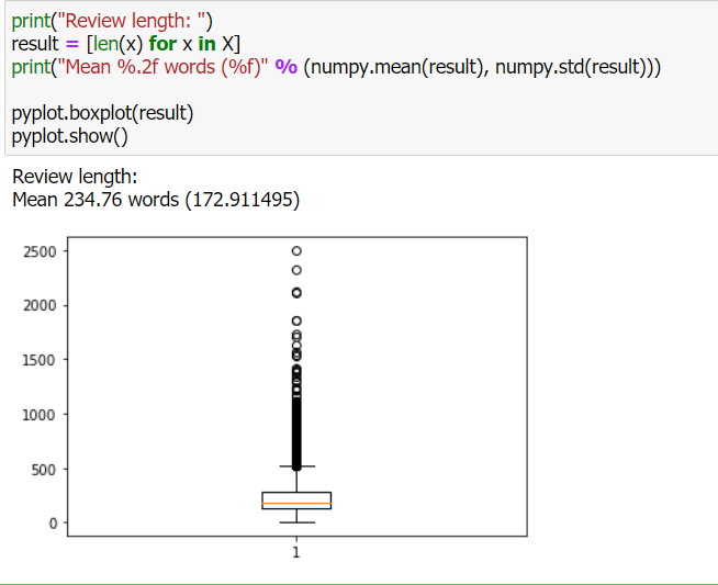
เติม 0 เพื่อทำให้ความยาวของประโยคเท่ากัน (Padding)
X_train = sequence.pad_sequences(X_train, maxlen=max_words)
X_test = sequence.pad_sequences(X_test, maxlen=max_words)

X_train.shape
นิยาม Model
model = Sequential()
model.add(Dense(8, input_dim=max_words, activation='relu'))
model.add(Dense(1, activation='sigmoid'))
model.compile(loss='binary_crossentropy', optimizer='adam', metrics=['accuracy'])
model.summary()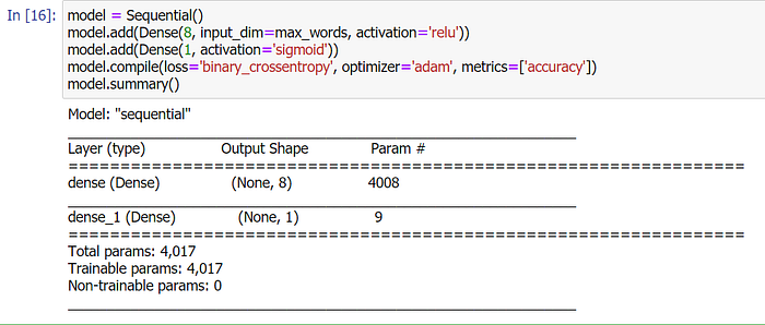
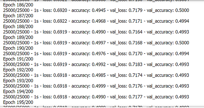
Train Model
history = model.fit(X_train, y_train, validation_data=(X_test, y_test), epochs=200, batch_size=128, verbose=2)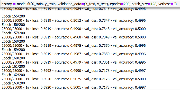
Plot Loss
plotly.offline.init_notebook_mode(connected=True)

h1 = go.Scatter(y=history.history['loss'],
                    mode="lines", line=dict(
                    width=2,
                    color='blue'),
                    name="loss"
                   )
h2 = go.Scatter(y=history.history['val_loss'],
                    mode="lines", line=dict(
                    width=2,
                    color='red'),
                    name="val_loss"
                   )

data = [h1,h2]
layout1 = go.Layout(title='Loss',
                   xaxis=dict(title='epochs'),
                   yaxis=dict(title=''))
fig1 = go.Figure(data = data, layout=layout1)
plotly.offline.iplot(fig1, filename="Intent Classification")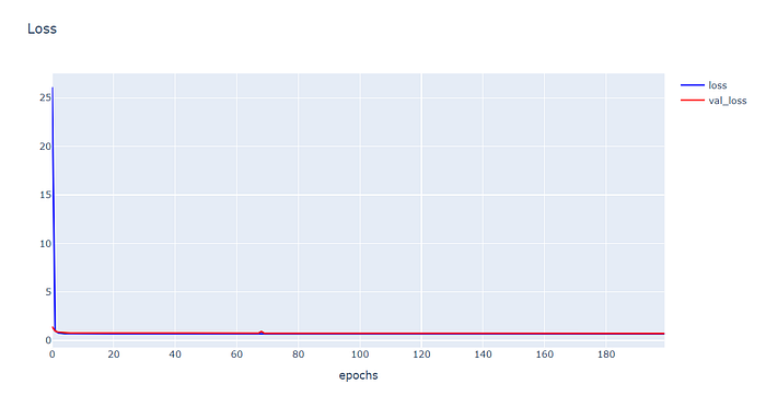
Plot Accuracy
h1 = go.Scatter(y=history.history['accuracy'],
                    mode="lines", line=dict(
                    width=2,
                    color='blue'),
                    name="acc"
                   )
h2 = go.Scatter(y=history.history['val_accuracy'],
                    mode="lines", line=dict(
                    width=2,
                    color='red'),
                    name="val_acc"
                   )

data = [h1,h2]
layout1 = go.Layout(title='Accuracy',
                   xaxis=dict(title='epochs'),
                   yaxis=dict(title=''))
fig1 = go.Figure(data = data, layout=layout1)
plotly.offline.iplot(fig1, filename="Intent Classification")
- จากกราฟ Loss จะเห็นว่าตั้งแต่ Epoch ที่ 1 ค่า Training Loss จะค่อนข้างราบเรียบ และจากกราฟ Accuracy ค่า Training acc จะค่อนข้างเหวี่ยง แต่ไม่มีแนวโน้มจะลดลงเลย ดังนั้นรูปแบบ Learning Curve ดังกล่าว แสดงว่า Model ของเราเกิดปัญหา Underfit ครับ
Overfit Learning Curve
- กราฟ Learning Curve แบบ Overfitting จะบ่งบอกว่า Model มีการเรียนรู้ได้จาก Training Dataset ได้ดีเกินไป คือมีการเรียนรู้จาก Noise หรือความผันผวนเกือบทุกรูปแบบจาก Training Dataset
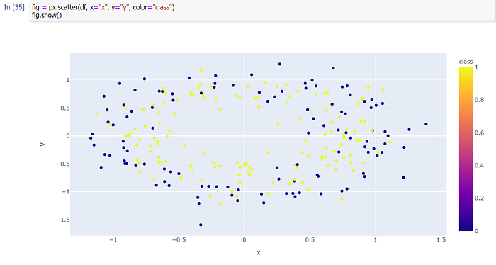
สร้าง Dataset แบบ 2 Class โดยใช้ Function make_circles ของ Sklearn
X, y = make_circles(n_samples=500, noise=0.2, random_state=1)แบ่งข้อมูลสำหรับ Train และ Test ด้วยการสุ่มในสัดส่วน 50:50
X_train, X_test, y_train, y_test = train_test_split(X, y, test_size=0.5, shuffle= True)

X_train.shape, X_test.shape, y_train.shape, y_test.shape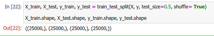
นำ Dataset ส่วนที่ Train มาแปลงเป็น DataFrame โดยเปลี่ยนชนิดข้อมูลใน Column “class” เป็น String เพื่อทำให้สามารถแสดงสีแบบไม่ต่อเนื่องได้ แล้วนำไป Plot
X_train_pd = pd.DataFrame(X_train, columns=['x', 'y'])
y_train_pd = pd.DataFrame(y_train, columns=['class'])

df = pd.concat([X_train_pd, y_train_pd], axis=1)---------------------------------------------------------------fig = px.scatter(df, x="x", y="y", color="class")
fig.show()
นิยาม Model
model = Sequential()
model.add(Dense(60, input_dim=2, activation='relu'))
model.add(Dense(30,  activation='relu'))
model.add(Dense(1, activation='sigmoid'))
model.compile(loss='binary_crossentropy', optimizer='adam', metrics=['accuracy'])
Train Model
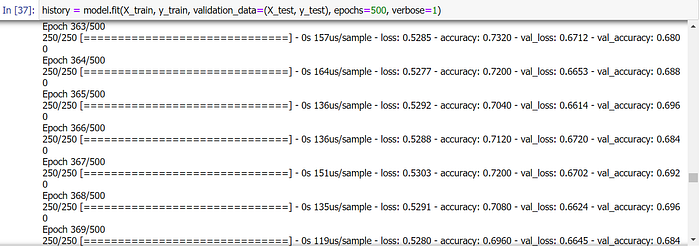
history = model.fit(X_train, y_train, validation_data=(X_test, y_test), epochs=500, verbose=1)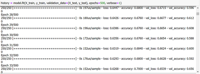
Plot Loss
plotly.offline.init_notebook_mode(connected=True)

h1 = go.Scatter(y=history.history['loss'],
                    mode="lines", line=dict(
                    width=2,
                    color='blue'),
                    name="loss"
                   )
h2 = go.Scatter(y=history.history['val_loss'],
                    mode="lines", line=dict(
                    width=2,
                    color='red'),
                    name="val_loss"
                   )

data = [h1,h2]
layout1 = go.Layout(title='Loss',
                   xaxis=dict(title='epochs'),
                   yaxis=dict(title=''))
fig1 = go.Figure(data = data, layout=layout1)
plotly.offline.iplot(fig1, filename="Intent Classification")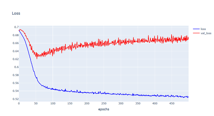
Plot Accuracy
h1 = go.Scatter(y=history.history['accuracy'],
                    mode="lines", line=dict(
                    width=2,
                    color='blue'),
                    name="acc"
                   )
h2 = go.Scatter(y=history.history['val_accuracy'],
                    mode="lines", line=dict(
                    width=2,
                    color='red'),
                    name="val_acc"
                   )

data = [h1,h2]
layout1 = go.Layout(title='Accuracy',
                   xaxis=dict(title='epochs'),
                   yaxis=dict(title=''))
fig1 = go.Figure(data = data, layout=layout1)
plotly.offline.iplot(fig1, filename="Intent Classification")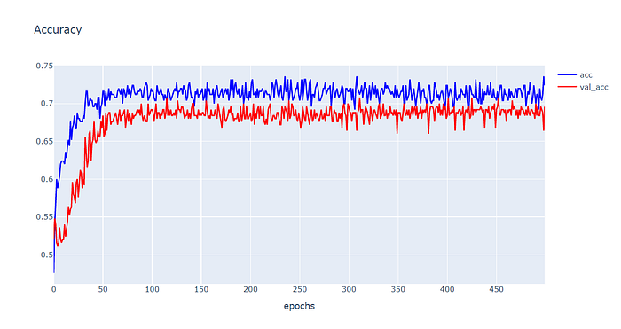
- ในการวิเคราะห์ปัญหา Overfitting เราจะพิจารณาจากกราฟ Loss เป็นหลัก โดยจากกราฟ Loss ด้านบน จะเห็นว่า Training Loss จะลดค่าลงอย่างต่อเนื่องเมื่อมีการ Train มากขึ้น ขณะที่ Validation Loss จะลดลงถึงจุดหนึ่งแล้วมีการเพิ่มค่าขึ้นเรื่อยๆ ตอลดการ Train
Good Fit Learning Curve
- เป็นเป้าหมายในการ Train Model ซึ่งกราฟแบบ Goog Fitting จะบ่งบอกว่า Model มีการเรียนรู้ที่ดี สามารถนำไป Predict ข้อมูลที่ไม่เคยพบเห็นได้อย่างแม่นยำ หรือเรียกว่า Model มีความเป็น Generalize ต่อ Data ใหม่ๆ (มี Generalization Error น้อย)
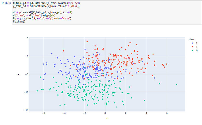
สร้าง Dataset แบบ 3 Class โดยใช้ Function make_blobs ของ Sklearn
X, y = make_blobs(n_samples=3000, centers=3, n_features=2, cluster_std=2, random_state=2)แบ่งข้อมูลสำหรับ Train และ Test ด้วยการสุ่มในสัดส่วน 60:40
X_train, X_test, y_train, y_test = train_test_split(X, y, test_size=0.4, shuffle= True)

X_train.shape, X_test.shape, y_train.shape, y_test.shape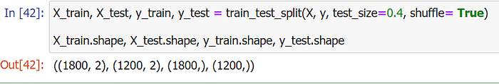
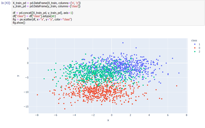
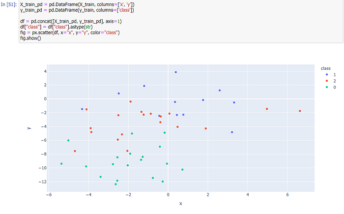
นำ Dataset ส่วนที่ Train มาแปลงเป็น DataFrame โดยเปลี่ยนชนิดข้อมูลใน Column “class” เป็น String เพื่อทำให้สามารถแสดงสีแบบไม่ต่อเนื่องได้ แล้วนำไป Plot
X_train_pd = pd.DataFrame(X_train, columns=['x', 'y'])
y_train_pd = pd.DataFrame(y_train, columns=['class'])

df = pd.concat([X_train_pd, y_train_pd], axis=1)
df["class"] = df["class"].astype(str)fig = px.scatter(df, x="x", y="y", color="class")
fig.show()
เราจะเข้ารหัสผลเฉลย แบบ One-Hot Encoding เพื่อที่ว่าเมื่อ Model มีการ Predict ว่าเป็น Class ไหน มันจะให้ค่าความมั่นใจ (Confidence) กลับมาด้วย
y_train = to_categorical(y_train)
y_test = to_categorical(y_test)
นิยาม Model
model = Sequential()
model.add(Dense(50, input_dim=2, activation='relu', kernel_initializer='he_uniform'))
model.add(Dense(3, activation='softmax'))

model.compile(loss='categorical_crossentropy', optimizer='adam', metrics=['accuracy'])
model.summary()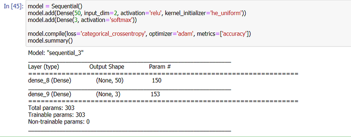
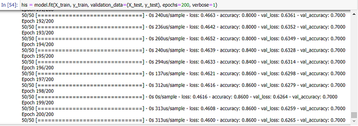
Train Model
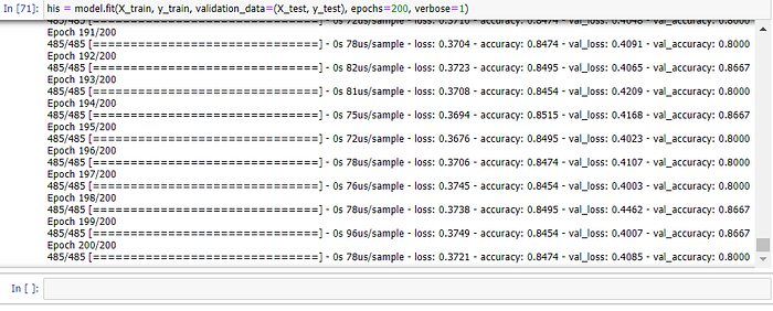
his = model.fit(X_train, y_train, validation_data=(X_test, y_test), epochs=200, verbose=1)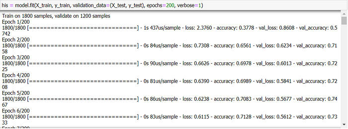
Plot Loss
plotly.offline.init_notebook_mode(connected=True)

h1 = go.Scatter(y=his.history['loss'],
                    mode="lines", line=dict(
                    width=2,
                    color='blue'),
                    name="loss"
                   )
h2 = go.Scatter(y=his.history['val_loss'],
                    mode="lines", line=dict(
                    width=2,
                    color='red'),
                    name="val_loss"
                   )

data = [h1,h2]
layout1 = go.Layout(title='Loss',
                   xaxis=dict(title='epochs'),
                   yaxis=dict(title=''))
fig1 = go.Figure(data = data, layout=layout1)
plotly.offline.iplot(fig1, filename="Intent Classification")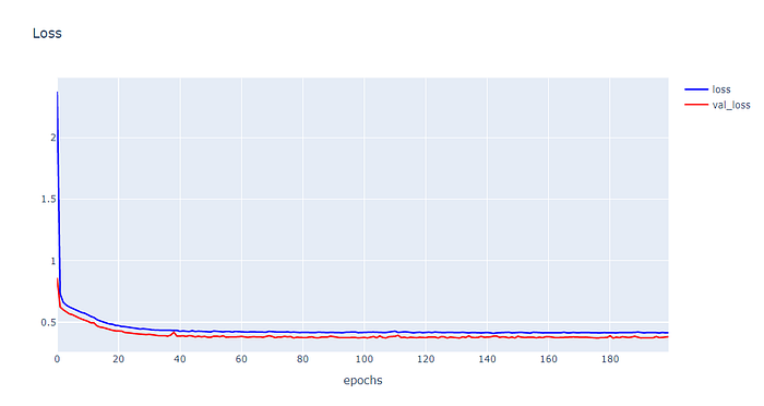
Plot Accuracy
h1 = go.Scatter(y=his.history['accuracy'],
                    mode="lines", line=dict(
                    width=2,
                    color='blue'),
                    name="acc"
                   )
h2 = go.Scatter(y=his.history['val_accuracy'],
                    mode="lines", line=dict(
                    width=2,
                    color='red'),
                    name="val_acc"
                   )

data = [h1,h2]
layout1 = go.Layout(title='Accuracy',
                   xaxis=dict(title='epochs'),
                   yaxis=dict(title=''))
fig1 = go.Figure(data = data, layout=layout1)
plotly.offline.iplot(fig1, filename="Intent Classification")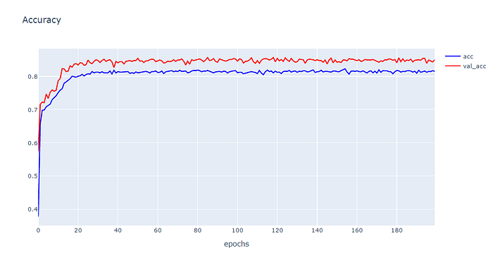
- จากกราฟ Loss ด้านบน จะเห็นว่าทั้ง Training Loss และ Validation Loss จะลดค่าลงอย่างต่อเนื่องจนถึงจุดหนึ่งมันจะคงที่ โดยทั้ง 2 กราฟจะมี Gap ระหว่างกันน้อยมาก ดังนั้นรูปแบบ Learning Curve ดังกล่าว แสดงว่าเป็น Model แบบ Good Fitting หรือเป็น Model ที่มีการเรียนรู้ที่ดี สามารถนำไป Predict ข้อมูลที่ไม่เคยพบเห็นได้อย่างแม่นยำ
Unrepresentative Train Dataset
- นอกจากเราจะใช้ Learning Curve ในการพิจารณาว่า Model มีประสิทธิภาพดีหรือไม่แล้ว เราสามารถใช้พิจารณาได้ว่า Dataset ที่นำมา Train และ Test เป็นตัวแทนของข้อมูลที่ดีหรือไม่
- เราจะจำลองสถานการณ์ของ Train Dataset ที่ไม่สามารถเป็นตัวแทนของข้อมูลที่ดี ดังขั้นตอนต่อไปนี้
สร้าง Dataset แบบ 3 Class โดยใช้ Function make_blobs ของ Sklearn
X, y = make_blobs(n_samples=100, centers=3, n_features=2, cluster_std=2, random_state=2)แบ่งข้อมูลสำหรับ Train และ Test ด้วยการสุ่มในสัดส่วน 50:50
X_train, X_test, y_train, y_test = train_test_split(X, y, test_size=0.5, shuffle= True)

X_train.shape, X_test.shape, y_train.shape, y_test.shape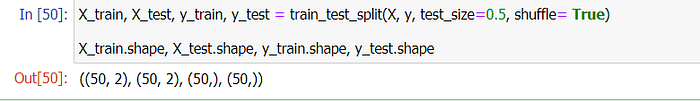
นำ Dataset ส่วนที่ Train มาแปลงเป็น DataFrame โดยเปลี่ยนชนิดข้อมูลใน Column “class” เป็น String เพื่อทำให้สามารถแสดงสีแบบไม่ต่อเนื่องได้ แล้วนำไป Plot
X_train_pd = pd.DataFrame(X_train, columns=['x', 'y'])
y_train_pd = pd.DataFrame(y_train, columns=['class'])

df = pd.concat([X_train_pd, y_train_pd], axis=1)
df["class"] = df["class"].astype(str)fig = px.scatter(df, x="x", y="y", color="class")
fig.show()
เข้ารหัสผลเฉลย แบบ One-Hot Encoding เพื่อที่ว่าเมื่อ Model มีการ Predict ว่าเป็น Class ไหน มันจะให้ค่าความมั่นใจ (Confidence) กลับมาด้วย
y_train = to_categorical(y_train)
y_test = to_categorical(y_test)
นิยาม Model
model = Sequential()
model.add(Dense(50, input_dim=2, activation='relu', kernel_initializer='he_uniform'))
model.add(Dense(3, activation='softmax'))

model.compile(loss='categorical_crossentropy', optimizer='adam', metrics=['accuracy'])
Train Model
his = model.fit(X_train, y_train, validation_data=(X_test, y_test), epochs=200, verbose=1)
Plot Loss
plotly.offline.init_notebook_mode(connected=True)

h1 = go.Scatter(y=his.history['loss'],
                    mode="lines", line=dict(
                    width=2,
                    color='blue'),
                    name="loss"
                   )
h2 = go.Scatter(y=his.history['val_loss'],
                    mode="lines", line=dict(
                    width=2,
                    color='red'),
                    name="val_loss"
                   )

data = [h1,h2]
layout1 = go.Layout(title='Loss',
                   xaxis=dict(title='epochs'),
                   yaxis=dict(title=''))
fig1 = go.Figure(data = data, layout=layout1)
plotly.offline.iplot(fig1, filename="Intent Classification")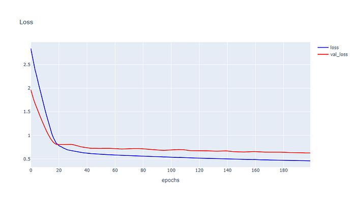
Plot Accuracy
h1 = go.Scatter(y=his.history['accuracy'],
                    mode="lines", line=dict(
                    width=2,
                    color='blue'),
                    name="acc"
                   )
h2 = go.Scatter(y=his.history['val_accuracy'],
                    mode="lines", line=dict(
                    width=2,
                    color='red'),
                    name="val_acc"
                   )

data = [h1,h2]
layout1 = go.Layout(title='Accuracy',
                   xaxis=dict(title='epochs'),
                   yaxis=dict(title=''))
fig1 = go.Figure(data = data, layout=layout1)
plotly.offline.iplot(fig1, filename="Intent Classification")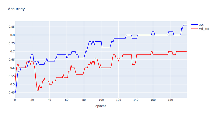
- จากกราฟ Loss และ Accuracy พบว่าทั้ง 2 ค่ามีแนวโน้มลดลงเรื่อยๆ เมื่อมีการ Train จำนวนมากขึ้น แต่มี Gap ระหว่าง Training Loss กับ Validation Loss และ Training Accuracy กับ Validation Accuracy สูง แสดงว่าเรามี Training Dataset น้อย ไม่เพียงพอในการ Train Model
Unrepresentative Validation Dataset
- เราจะจำลองสถานการณ์ของ Validation Dataset ที่ไม่สามารถเป็นตัวแทนของข้อมูลที่ดี ใน 2 สถานการณ์
++ สถานการณ์ที่ 1 Validate น้อย และไม่สามารถเป็นตัวแทนของ validation dataset ได้
++ สถานการณ์ที่ 2 Validate น้อย และง่ายเกินไป
สถานการณ์ที่ 1 มีขั้นตอนการทดลองดังต่อไปนี้
สร้าง Dataset แบบ 3 Class โดยใช้ Function make_blobs ของ Sklearn
X, y = make_blobs(n_samples=500, centers=3, n_features=2, cluster_std=10, random_state=2)แบ่งข้อมูลสำหรับ Train และ Test ด้วยการสุ่มในสัดส่วน 95:5
X_train, X_test, y_train, y_test = train_test_split(X, y, test_size=0.05, shuffle= True)

X_train.shape, X_test.shape, y_train.shape, y_test.shape
นำ Dataset ส่วนที่ Train มาแปลงเป็น DataFrame โดยเปลี่ยนชนิดข้อมูลใน Column “class” เป็น String เพื่อทำให้สามารถแสดงสีแบบไม่ต่อเนื่องได้ แล้วนำไป Plot
X_train_pd = pd.DataFrame(X_train, columns=['x', 'y'])
y_train_pd = pd.DataFrame(y_train, columns=['class'])

df = pd.concat([X_train_pd, y_train_pd], axis=1)
df["class"] = df["class"].astype(str)fig = px.scatter(df, x="x", y="y", color="class")
fig.show()

เข้ารหัสผลเฉลย แบบ One-Hot Encoding เพื่อที่ว่าเมื่อ Model มีการ Predict ว่าเป็น Class ไหน มันจะให้ค่าความมั่นใจ (Confidence) กลับมาด้วย
y_train = to_categorical(y_train)
y_test = to_categorical(y_test)
นิยาม Model
model = Sequential()
model.add(Dense(50, input_dim=2, activation='relu', kernel_initializer='he_uniform'))
model.add(Dense(3, activation='softmax'))

model.compile(loss='categorical_crossentropy', optimizer='adam', metrics=['accuracy'])
Train Model
his = model.fit(X_train, y_train, validation_data=(X_test, y_test), epochs=200, verbose=1)
Plot Loss
plotly.offline.init_notebook_mode(connected=True)

h1 = go.Scatter(y=his.history['loss'],
                    mode="lines", line=dict(
                    width=2,
                    color='blue'),
                    name="loss"
                   )
h2 = go.Scatter(y=his.history['val_loss'],
                    mode="lines", line=dict(
                    width=2,
                    color='red'),
                    name="val_loss"
                   )

data = [h1,h2]
layout1 = go.Layout(title='Loss',
                   xaxis=dict(title='epochs'),
                   yaxis=dict(title=''))
fig1 = go.Figure(data = data, layout=layout1)
plotly.offline.iplot(fig1, filename="Intent Classification")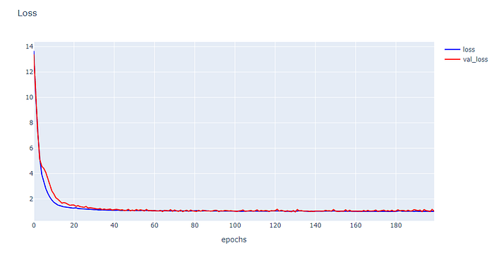
Plot Accuracy
h1 = go.Scatter(y=his.history['accuracy'],
                    mode="lines", line=dict(
                    width=2,
                    color='blue'),
                    name="acc"
                   )
h2 = go.Scatter(y=his.history['val_accuracy'],
                    mode="lines", line=dict(
                    width=2,
                    color='red'),
                    name="val_acc"
                   )

data = [h1,h2]
layout1 = go.Layout(title='Accuracy',
                   xaxis=dict(title='epochs'),
                   yaxis=dict(title=''))
fig1 = go.Figure(data = data, layout=layout1)
plotly.offline.iplot(fig1, filename="Intent Classification")
สถานการณ์ที่ 2 มีขั้นตอนการทดลองดังต่อไปนี้
สร้าง Dataset แบบ 3 Class โดยใช้ Function make_blobs ของ Sklearn
X, y = make_blobs(n_samples=500, centers=3, n_features=2, cluster_std=2, random_state=2)แบ่งข้อมูลสำหรับ Train และ Test ด้วยการสุ่มในสัดส่วน 97:3
X_train, X_test, y_train, y_test = train_test_split(X, y, test_size=0.03, shuffle= True)

X_train.shape, X_test.shape, y_train.shape, y_test.shape
นำ Dataset ส่วนที่ Train มาแปลงเป็น DataFrame โดยเปลี่ยนชนิดข้อมูลใน Column “class” เป็น String เพื่อทำให้สามารถแสดงสีแบบไม่ต่อเนื่องได้ แล้วนำไป Plot
X_train_pd = pd.DataFrame(X_train, columns=['x', 'y'])
y_train_pd = pd.DataFrame(y_train, columns=['class'])

df = pd.concat([X_train_pd, y_train_pd], axis=1)
df["class"] = df["class"].astype(str)fig = px.scatter(df, x="x", y="y", color="class")
fig.show()
เข้ารหัสผลเฉลย แบบ One-Hot Encoding เพื่อที่ว่าเมื่อ Model มีการ Predict ว่าเป็น Class ไหน มันจะให้ค่าความมั่นใจ (Confidence) กลับมาด้วย
y_train = to_categorical(y_train)
y_test = to_categorical(y_test)
นิยาม Model
model = Sequential()
model.add(Dense(50, input_dim=2, activation='relu', kernel_initializer='he_uniform'))
model.add(Dense(3, activation='softmax'))

model.compile(loss='categorical_crossentropy', optimizer='adam', metrics=['accuracy'])
Train Model
his = model.fit(X_train, y_train, validation_data=(X_test, y_test), epochs=200, verbose=1)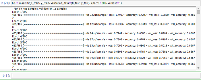
Plot Loss
plotly.offline.init_notebook_mode(connected=True)

h1 = go.Scatter(y=his.history['loss'],
                    mode="lines", line=dict(
                    width=2,
                    color='blue'),
                    name="loss"
                   )
h2 = go.Scatter(y=his.history['val_loss'],
                    mode="lines", line=dict(
                    width=2,
                    color='red'),
                    name="val_loss"
                   )

data = [h1,h2]
layout1 = go.Layout(title='Loss',
                   xaxis=dict(title='epochs'),
                   yaxis=dict(title=''))
fig1 = go.Figure(data = data, layout=layout1)
plotly.offline.iplot(fig1, filename="Intent Classification")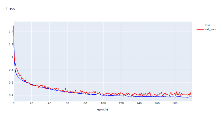
Plot Accuracy
h1 = go.Scatter(y=his.history['accuracy'],
                    mode="lines", line=dict(
                    width=2,
                    color='blue'),
                    name="acc"
                   )
h2 = go.Scatter(y=his.history['val_accuracy'],
                    mode="lines", line=dict(
                    width=2,
                    color='red'),
                    name="val_acc"
                   )

data = [h1,h2]
layout1 = go.Layout(title='Accuracy',
                   xaxis=dict(title='epochs'),
                   yaxis=dict(title=''))
fig1 = go.Figure(data = data, layout=layout1)
plotly.offline.iplot(fig1, filename="Intent Classification")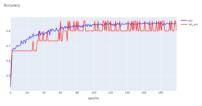
Dataset ที่ 2 จะเป็น reuters
- จะแนะนำวิธีที่ใช้งานได้สะดวกที่สุด คือ Good Fit Learning Curve
โหลด Dataset
top_words = 5000
(X_train, y_train), (X_test, y_test) = reuters.load_data(num_words=top_words)
max_words = 500

X_train.shape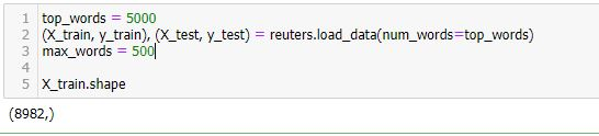
นิยาม Model
model = Sequential()
model.add(Dense(8, input_dim=max_words, activation='relu'))
model.add(Dense(1, activation='sigmoid'))
model.compile(loss='binary_crossentropy', optimizer='adam', metrics=['accuracy'])
model.summary()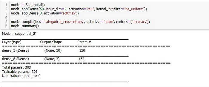
Train Model
his = model.fit(X_train, y_train, validation_data=(X_test, y_test), epochs=200, batch_size=128, verbose=2)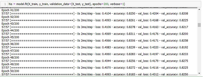
Plot Loss
plotly.offline.init_notebook_mode(connected=True)

h1 = go.Scatter(y=his.history['loss'],
                    mode="lines", line=dict(
                    width=2,
                    color='blue'),
                    name="loss"
                   )
h2 = go.Scatter(y=his.history['val_loss'],
                    mode="lines", line=dict(
                    width=2,
                    color='red'),
                    name="val_loss"
                   )

data = [h1,h2]
layout1 = go.Layout(title='Loss',
                   xaxis=dict(title='epochs'),
                   yaxis=dict(title=''))
fig1 = go.Figure(data = data, layout=layout1)
plotly.offline.iplot(fig1, filename="Intent Classification")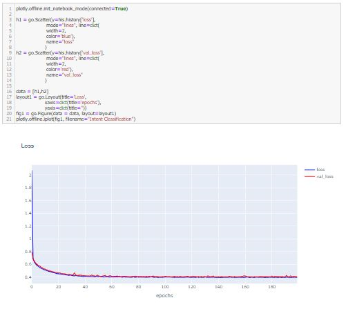
Plot Accuracy
h1 = go.Scatter(y=his.history['accuracy'],
                    mode="lines", line=dict(
                    width=2,
                    color='blue'),
                    name="acc"
                   )
h2 = go.Scatter(y=his.history['val_accuracy'],
                    mode="lines", line=dict(
                    width=2,
                    color='red'),
                    name="val_acc"
                   )

data = [h1,h2]
layout1 = go.Layout(title='Accuracy',
                   xaxis=dict(title='epochs'),
                   yaxis=dict(title=''))
fig1 = go.Figure(data = data, layout=layout1)
plotly.offline.iplot(fig1, filename="Intent Classification")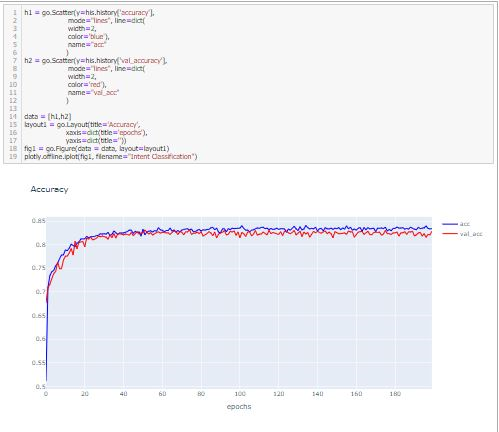
สำหรับครั้งนี้ก็มรเท่านี้ครับ
***Thank You For Watching****